Pantone Unveils 2012 Color Inspiration and Direction for
the Home Furnishings and Interior Design Industries
At the International Home + Housewares Show in Chicago this month, Pantone LLC, an X-Rite company and the global authority on color and provider of professional color standards for the design industries, today announced PANTONE® VIEW home + interiors 2012, a trend forecast containing the nine most directional color palettes for home furnishings and interior design in 2012. “PANTONE VIEW home + interiors 2012 is the road map to color for 2012, which is filled with interesting new directions,” said Leatrice Eiseman, executive director of the Pantone Color Institute®.
 |
| The color of the year for 2011 |
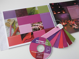
PANTONE VIEW home + interiors 2012 is a forecasting book that provides color and trend direction, enabling designers to select the right shades and combinations for home furnishings or interior spaces. PANTONE VIEW home + interiors 2012 contains visual inspiration, suggested color harmonies, individual tear-out palette cards for each of the nine forecasted palettes, swatches of the 73 forecasted colors, and images from the forecast for use in presentations and storyboards. Additionally, PANTONE VIEW home + interiors 2012 includes the PANTONE FASHION + HOME digital color library which enables direct download of all the PANTONE FASHION + HOME palette colors into design software.
The nine palettes for 2012 are: Nonchalance, Subtleties, Resilience, Indigo Effects, Transcending Time, Back to the Fuchsia, Reflections, Nouveau Neon and The Comics.
The simplicity and casual ambiance in this palette, called Nonchalance, are easy toread and enjoy. The reassuring colors coax a feeling of tranquility and relaxation with no suggestion of anxiety in the surroundings. The comforting pastel pinks, ethereal blues and soft egret white wrap us in carefree baby blanket colors, harmoniously blending with the more mature taupe, gray and grape tones.
Subtleties are just that – a close connectivity between the color families, sliding effortlessly into a seamless collection of hues that are either closely related or quietly complementary. The atmosphere they present is effortless and compatible: hazy coral, soft yellow green, faded rose, stonewashed blue and tinges of gray and green artfully set against a tasteful brown earthy red.
Resilience represents a group of sturdy hues that work very well together. It speaks of hand-hewn objects of substance, sustenance and solidity in a range of natural, outdoor shades. There are nuances of the deepest browns, varietal mushroom tones, foliage green and greenish yellow. A dash of flamingo orange adds an exotic touch to this otherwise organic grouping.
Like the twilight colors of a descending night sky, Indigo Effects evokes a mood of broad expansiveness and depth – enveloping and protective, yet mysterious. The colors are variations on a blue theme – celestial and majestic blues, purpled and deep blue indigos – all deftly brushed with contrasting strokes of maroon, mauve and moody gray.
Transcending Time is a palette that speaks of continuity – inspirations from the past, both style and color-wise, which continue well into the future – containing hues that heirlooms are made of, including elegant wine and plum, warm beige and wood tones, as well as classic rose. A touch of frosted almond adds a soft and subtle glimmer to the atmosphere.
Bold, daring and audacious, this is a group of tantalizing colors that makes no excuses for the attention it creates. Back to the Fuchsia celebrates the energy generated through the provocative melding of dancing reds, purples and pink, all highlighted by a variety of fuchsias. Jewel-toned peridot both accentuates and complements the hotter hues.
Glossy finish and color are a magical coupling, fascinating the eye and riveting attention. Metallic or glassy surfaces undulate and move and twist and turn, taking colors to new dimensions. Included in this arresting palette, called Reflections, are tones and tints that spark the imagination: Turkish sea, blue moon, garnet, beluga, cloud dancer as well as the classic silver and gold.
The colors of the Nouveau Neon palette are not the phosphorescent neons of yesterday. They are instead a collection of exuberant shades that bring a fresh new perspective to combinations. Asian-inspired bamboo yellow-green plays with orange Popsicle® and berry purples, while citrus colors toy with pink and raspberry. A flavorful butter-rum tan is the unexpected accompaniment to all of the vibrant colors in the palette.
Cartoons come to life in this effervescent palette called The Comics. Funny paper hues pop off the page in whimsical ways that bring a smile and create the need to take some time to play. Ominous phantom black provides the backdrop for sulphuric yellow and fiery red. A flash of green provokes a strong blue while an inky cyan plays up to honeysuckle and primrose. It’s quirky joy and spontaneity.
About Pantone
Pantone, a wholly owned subsidiary of X-Rite, Incorporated, has been the world’s color authority for nearly 50 years, providing design professionals with products and services for the colorful exploration and expression of creativity. Always a source for color inspiration, Pantone now offers paint and designer-inspired products and services for consumers. More information is available at www.pantone.com.


